


10/3/2020
By Brandon Brown
ESN Director of Content
It is time for our third ranking in the new series where we break down the top uniforms in Seattle sports history. Today’s edition features the Seattle Mariners. A team with little to no success in their history, but with a few good-looking threads. From the early days of the blue and yellow, to the modern-day navy and teal we look at the best of the best for the M’s.
The rules for these lists continue to be the same. We are selecting the top 5 from the franchise’s history. Only ones wore by the current iteration of the team will be allowed, so no Pilots as they are Milwaukee. Anything worn from 1977 to now will be considered.
5. Powder Blue (80’s)


Nothing screams 80’s baseball more than these bad boys. Back when Seattle used to have yellow and no version of teal in their look, the powder blues somehow made it work. The sharp font that we have not seen since looked great. The yellow and light blue stripes down the side of the shoulders also add a nice touch. Having the pants also be the same color was a bold choice that would not work as well today. But these deserved to make the list and #5 is where they land.
4. Modern Teal (2010’s)
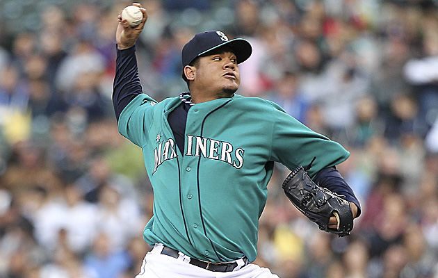
These are a modern take on an old school look. The teal uni’s were first seen by the Seattle fans in the 90’s when Griffey and Buhner were rocking them. These ones are a little bit brighter than their predecessors and look sharp as hell paired with the two-toned cap. I would compare these to the Seahawks actin green jerseys, you either hate them or love them. #4 is the right spot for them.
3. Modern Navy (2000’s)
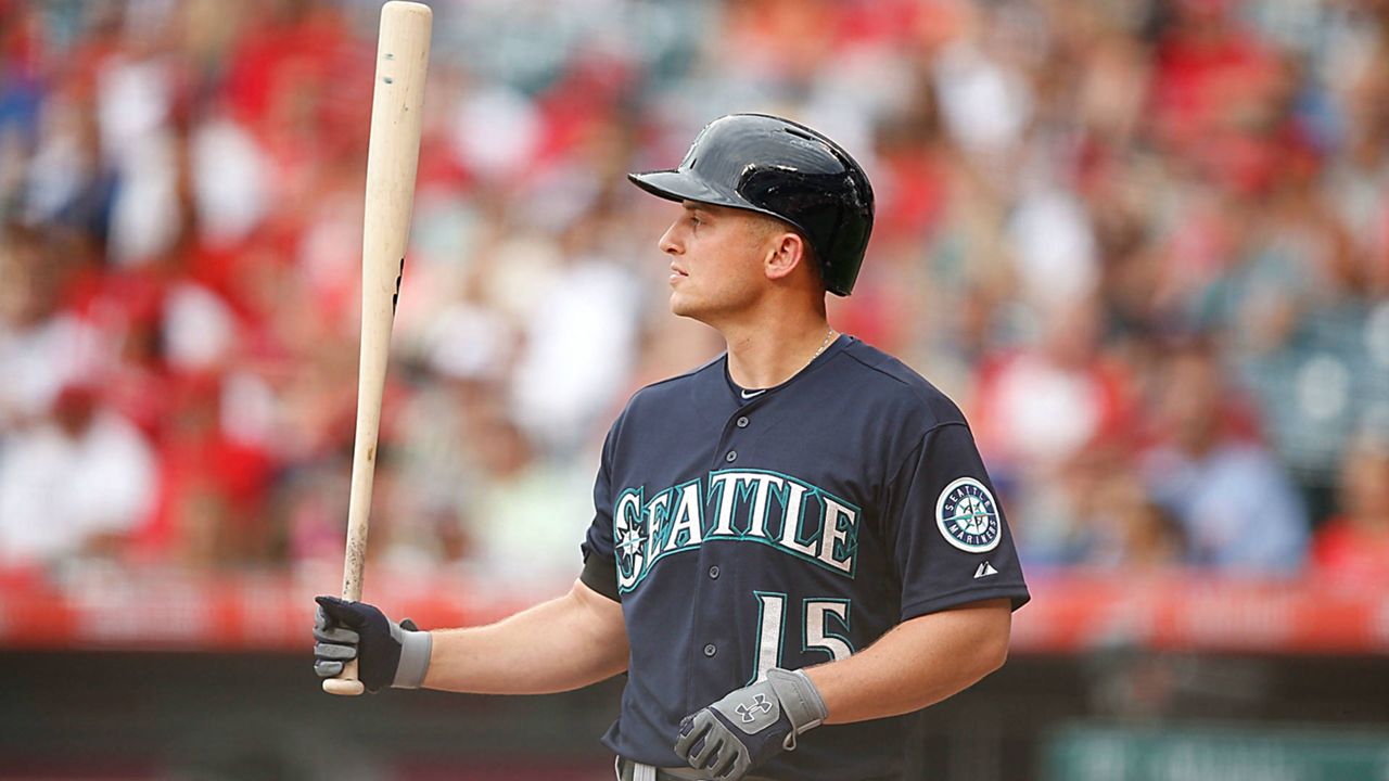
Another one to make our list that is an updated version of a 90’s look. The modern navy uniforms are clean and show off the Mariners’ primary color beautifully. Where the 90’s version featured a silver stripe down the chest and around the neck, these ones do not. Less clutter makes for a cleaner look forever and always. The numbers and letters being silver with a teal and navy outline make them pop as well. It was tough not to put these one higher, but #3 is a good spot.
2. Home Whites (2010’s)
:no_upscale()/cdn.vox-cdn.com/uploads/chorus_asset/file/13633456/1020432776.jpg.jpg)
If you have been following our rankings closely, you will know that all white is a favorite of this writer, and that does not change here. A slight change had been made to these a couple years ago which makes them even better as well. They switched the order of the colors outlining the lettering, making white be the color touching navy. This made them pop a lot more to the eye and was an excellent choice. The slight navy stripes down the chest and pant legs give it a little flair as well. They just lose out to our number 1 spot.
1. Sunday’s Best (2010’s)
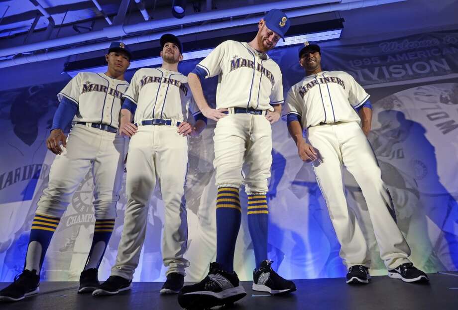
Boy oh boy, these are nice. Introduced back in 2015 as a Sunday home alternate look. These uniforms bring back the franchises original color scheme. What is even better about these ones is that they aren’t white. Instead they are a cream which works so well. Everything is still in the current logo look, but with the old school colors. This is something you would see on a soccer kit. These need to last forever because I do not see the M’s ever topping these. Without question, these deserve the top spot.
So, there you have it, the top uniforms in the Mariners history. It would be nice to see some of these with a postseason patch on them, but who knows when that will ever happen. These 5 will be added to our bracket to determine the best uniform in Seattle sports history which you will vote on in our social media. Just 3 more lists to go before we rank the best uniform in the region’s history.