By Brandon Brown
ESN Director of Content
Our first ranking in this new series went up last week as we broke down the top 5 uniforms in Seahawks history, now it is time for their roomates the Seattle Sounders. Where as the Hawks have had very few uniform changes over their history, the Sounders get a new kit every single season. Flip flopping between new home and new away every season. So, their history gave us a lot of options and a ton of quality choices. From the classic Rave Green to some not so familiar colors, we break down the best uniforms in Sounders history.
Just like the last list, we will be focusing only on the top 5, as we will be doing a large bracket challenge at the conclusion of these lists. With the Sounders, we will only be looking at kits from their MLS stint. That means everything from 2009 and on. Also, sorry Stefan Frei, but we will only be focusing on main uniforms and not keeper kits. I have wasted enough of your time already, so let us get started.
5. Pacific Blue (2016)

Taking the #5 spot on our list is the Pacific Blue kit from 2016. Talk about cool blue. This jersey was designed to mimic the waters of Puget Sound and it did that perfectly. The kit uses a heathered effect with blue and neon blue to look like the depths of the cities most famous body of water. The lighter blue shorts are the perfect pairing and keeps the aquatic look going. The addition of the seal of the the Seattle city flag on the bottom left hand side adds a nice flare to it all.
4. Electricity (2010-2011)

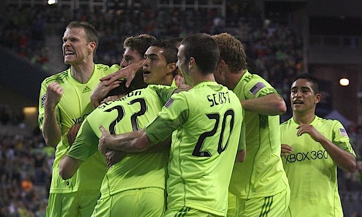
In your face, that is all that needs to be said about these bad boys. On the announcement of these kits, the Sounders described them as “Bright. Bold. Electric.” and that is an understatement. The green goes from top to bottom as even the socks matched the ‘electric’ look. Fans of world soccer/football will know that teams love to try kits with bold colors that aren’t necessarily their primary color, so these fit right in. The initial reception on these were mixed but became a cult classic of sorts as time went on, despite them primarily being used for friendlies and U.S. Open Cup matches. These slide into the 4 spot, see what I did there?
3. Rave Green (2011-12)

The personal favorite of yours truly, the Rave Green kit during the 2010 and 2011 seasons just lands outside of the top 2. Nothing is more iconic to the Sounders than their Rave Green kits, as they have worn a version of them every year since their inaugural MLS season in 2009. This was the best of all the iterations though. A chrome ‘X’ crosses the back and wraps around the front of the kit giving a nice color combination with the blue and green. This is one kit that the long sleeve version looks better than the short as well. The ‘Cascade Shale’ version of these could also take this spot, but decided to go with the more recognizable colors.
2. Nightfall (2019-2020)

Real men wear pink. These kits are based off the sunset that can be seen during night matches at CenturyLink Field. Outside of the new Zulily sponsorship across the chest, there was not a lot of complaints about these and there was a ton of praise. Pink and black is a fire combination in any form and having them on a kit is even better. The stripes gradually getting larger down the side works perfectly and allows for pink to be present without taking over the kit. The crest being in the color scheme is also so good. It will be a sad day when these puppies are retired at the end of this season.
1. Pitch Black (2015-15)

The king of kings and the best kit in history, so far, has to be ‘Pitch Black’. The funny thing is, there isn’t a hell of a lot going on with these but minimal can look amazing. These look a lot like the ‘Nightfall’ jerseys but without the side stripes. The Green is a color that people appreciate more than pink as well when it comes to this team. The radiant green trim also appears on the socks and shorts as the primary color. These were so popular that they even won mlssoccer.com’s bracket of the best kit in league history. Makes you think the Sounders should just adopt black as one of their primary colors.


