


By Brandon Brown
ESN Director of Content
After ranking the best branding in the state when it came to pro and minor league franchises, it was only right that we naturally moved on to uniforms. Seattle has a rich history of having some of the best-and worst-uniforms in their respective sports, but we will be sticking with the positives for the time being. We will look at every aspect of the uniform in question and break them down from pants/shorts all the way to helmet/cap. With that being said, 1 piece of clothing could make or break a uniform and could be the difference between a top spot or possibly missing out on the list entirely. These lists will only be top 5, just to keep it nice and short. After all of the teams have their top 5 list, we will then do a best uniform of all-time list to cap it all off.
First up in our rankings will be the Seattle Seahawks.
With football season upon us, it only seemed right that the Hawks kick off our listing. The oldest current franchise playing in the city of Seattle, the Seahawks were the winner of our best ‘Pro’ branding ranking and for good reason. They have a great logo and one of the best color schemes in the entire NFL. The Hawks haven’t changed uniforms much over their history. In fact, in their 40+ years they have only had 2 major uniform changes from their originals in ’76. So, you will definitely see multiple from the same era on this list.
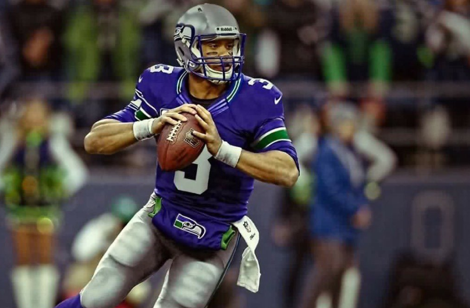
5. Action Green Jersey/Blue Pants (2019-Current)
/cdn.vox-cdn.com/uploads/chorus_image/image/65834381/usa_today_13751004.0.jpg)


Easily the most divisive uniform that will appear on this list, the action green uniform made it’s first appearance back on Dec. 15 of 2016 against the Los Angeles Rams. It was unveiled as part of the NFL’s ‘Color Rush’ series for Thursday Night Football. All teams wore a uniformed color and most picked their ‘boldest’ color to be the primary. The Seahawks just happened to have the boldest color out there with what is called ‘Action Green’. When the team wore it initially, they would combo it with green pants as well which gave off some highlighter vibes no doubt. But their placement on this list is for their 2019 ideration which saw the Hawks wear their blue pants with the jersey against the Vikings. The break up of blue helmet, green jersey then blue pants made it less in your face and a better look. By no means should this jersey be worn more than once or twice a year, but it is a fun look that improves with the blue pants. At least we can all agree that they are much better than those 2009 ones they only rolled out for one game.
4. All White (2002-2011)
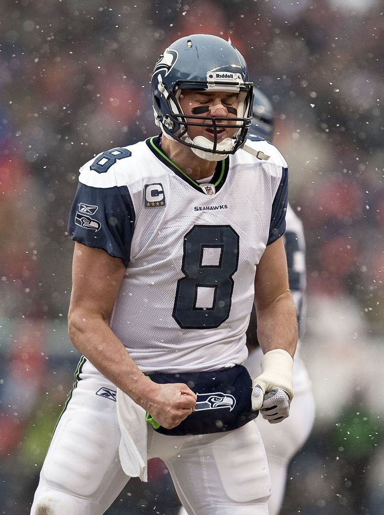
Some may be shocked to see these uniforms on the list, as the 02-11 uniforms are seen as the worst in the franchises history. The all whites that they wore during this time are very underrated though. The home navy jersey from this period suffered from one huge flaw, it didn’t have anything to make it stand out much. Outside of the white lettering, it really just looked like a navy t-shirt. The away whites fixed that by having the lower shoulder be the iconic blue. It gave the jersey a much needed accent break and improved on the look a lot. Pairing it with the white pants instead of the blue gave it an ‘icy’ cool look. These uniforms get a lot more hate than they deserve just because they sit between two of the best uniforms in franchise history. I’m not saying do a throwback to these bad boys, but they deserved to be on this list.
3. White Jersey/Blue Pants (2012-Current)
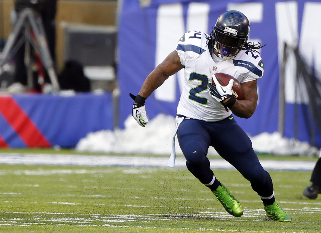
If it’s good enough to win a Superbowl in, then it’s good enough to make this list. The white jersey and blue pants of the modern uniform is just a clean look. All white on the road is nice as well, but the Hawks have moved away from using white pants at all in their combos. The blue pants on the other hand have a similar aesthetic to the action green ones above, as it sandwiches the colors perfectly. Having a blue helmet and blue pants make the white jersey stand out more. It is the best away look that the franchise has ever had and hopefully continues to be the go to when Seattle travels.
2. All Blue (2012-Current)
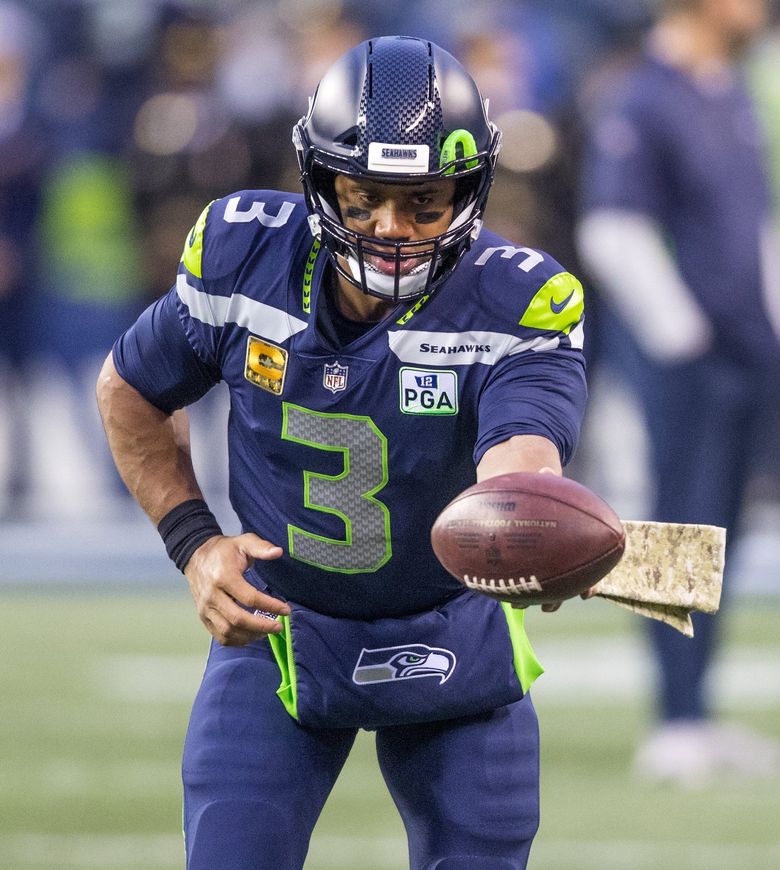
The uniform that rang in a new era of Seahawks football. When these were announced people lost their collective minds at the design. Immediately players around the league were giving props to the Hawks for having the best uniforms in the game, and it’s easy to see why. The update was apart of Nike taking over the uniform design for the league. The Rebook era for Seattle wasn’t exactly the brightest and they wanted to really pop with the redesign. It was designed to show the teams history, with feathers being wrapped around the collar and going down the length of the pant. They can also be seen inside of the numbers and along a subtle stripe of the helmet. The number 12 shows up throughout the uniform to pay homage to the crazy loud fans that support the franchise. The use of action green as an accent color makes everything bolder, the grey stripes across the chest also make use of their new color option while also throwing it back to the silver days of past.
Everything about this uniform is modern and aesthetically pleasing. Some may argue that other uniforms are better, but it is hard to beat this look compared to other current teams looks.
1. Blue Jersey/Silver Pants (1983-2001)
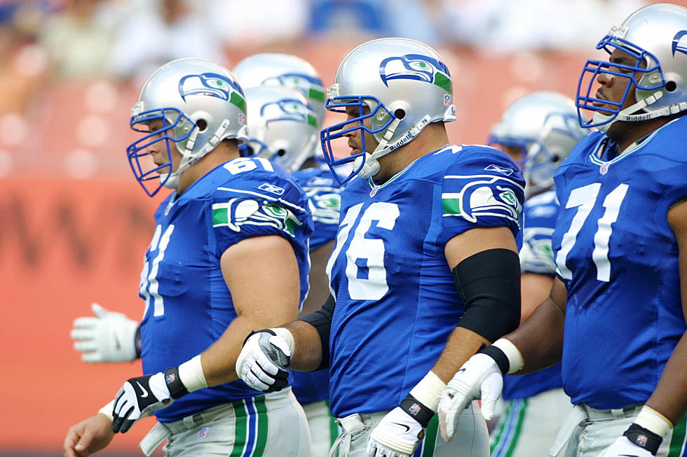
The king is here. The best uniforms of all-time in Seahawks history has to go to the 83-01 blue jersey and silver pants look. A slightly upgraded look from the initial uniform, this one features the Seahawks logo on the shoulder pad. And despite the great modern look of the current logo, the old school one had a little more of a Northwest feel to it and looked a lot more like the original wood carving that it was based off of. The lighter blue and darker green are also more of an old school feel but do the job perfectly. The real winners of this look have to be the silver helmet and pants though. A look that we have not truly seen since, the wolf grey is nice but just not the same. The numbers are big and bold with no outline needed. There is no name across the chess because there is no need for one. You know what team this is and their unique look gets the job done.
There is a reason that fans have been begging for the Hawks to bring these back, even if it’s just for an alternate. If Nike could change nothing-I mean NOTHING-but slap their logo on it and use their own special Nike jersey material, then Seattle would no doubt have the best look in the league whenever they wore these. Bring em back fellas.
Elisportsnetwork.com